The American Dream died in February 1973.  
Tuesday, March 10, 2009 at 05:08PM
Skeptic in Favorites, Middle Class

Since Bob Herbert wrote about Reviving the Dream today, this is a good time to put up the problem-defining graphs from a longer analysis I haven't finished.

The American middle class and working class are essentially the more than 90 million non-supervisory "production workers" who constitute 84% of non-government, non-farm employment. For 26 years, from 1947 to January 1973, their average hourly pre-tax earnings, adjusted for inflation using current methods, grew robustly and steadily at an average annual "real" rate of about 2.2%. At that rate, average purchasing power would double in 33 years. Parents expected their children to have more prosperous lives than their own, and it was happening. It was the Golden Age of the Middle Class. Then, suddenly and permanently, it ended in February 1973.

From 1947 to 1973 real average hourly wage of production workers rose 2.2 percent annually to about $18 per hour in 2009 dollars and then declined to about $16 from the early 1980s to 1997 and stayed below $18 for 35 years until it spiked to just over $18 in late 2008

The proximate cause of the sudden change is obvious. By definition, all of these "production workers" are "employed," and the BLS hourly earnings statistics are gathered from payroll records. Before 1973, employers as a group were giving their existing workforces average annual pay increases that exceeded the inflation rate by 2.2 percentage points. After 1972, they handed out increases that on average only just kept even with inflation.

From 1948 to 1972 production workers got average annual real wage increases averaging 2.35 pct, but from 1973 to 2008 the average annual real wage increase was only 0.01 pct

Meanwhile, the larger economy measured by real GDP per employee had a stagnant decade from 1973 to 1983. But then it took off and averaged 1.14% annual average growth for 25 years. That is modest growth compared to the 2.69% average from 1947 to 1973, but since 5/6 of American workers got a zero share of the post-1983 growth, those who did —presumably management and the owners of capital—did quite nicely.

From 1947 real average hourly earnings of production workers tracked with real GDP per production worker until 1963 when real GDP per production worker began to increase faster and continued to increase faster every year through 2008

So, here's the problem in a nutshell. Average real earnings of the 5/6 of Americans who are production workers cannot go up—and the American Dream cannot be revived—unless employers consistently grant annual wage/salary increases that on average exceed the inflation rate. What changes would motivate and enable large, trend-setting employers to return to giving average annual wage increases—for their existing workforces—that exceed inflation by 1% or 2%?

Update on Monday, March 16, 2009 at 09:26AM by Registered CommenterSkeptic

Why February 1973 and not some other date? Some facts and conjectures: The inflation rate spiked to 12% in 1974 (and later to 15% in 1980), and there was a recession lasting until 1975. Link. The 1973-74 bear market began in February 1973; from a high in January, the value of the S&P 500 declined by more than half over the next 21 months. Link. The trailing 12-months P/E ratio of the S&P 500, which had been close to 17-18 since 1958 slumped to 7-11 for about a decade. Link. Presumably, there was a perception that the quality of corporate earnings was poor because they were being largely eaten by inflation. I recall great pressures, including from leveraged hostile take-overs, to cut costs, boost near-term earnings, and "create shareholder value."  Perhaps that's enough to account for the real hourly earnings decline from 1973 until the 1983 end of a deep recession.  But why did real hourly earnings continue to stagnate from 1983 to 1997?  And from 2002 to 2009?

Update on Monday, March 16, 2009 at 10:06PM by Registered CommenterSkeptic

David Kamp says that the idea of economic progress for the middle class is outmoded and we should get used to the idea of continuity.

And what about the outmoded proposition that each successive generation in the United States must live better than the one that preceded it? While this idea is still crucial to families struggling in poverty and to immigrants who’ve arrived here in search of a better life than that they left behind, it’s no longer applicable to an American middle class that lives more comfortably than any version that came before it. (Was this not one of the cautionary messages of the most thoughtful movie of 2008, wall-e?) I’m no champion of downward mobility, but the time has come to consider the idea of simple continuity: the perpetuation of a contented, sustainable middle-class way of life, where the standard of living remains happily constant from one generation to the next.

By what measure does the American middle class live more comfortably than the 1972 version? Mr. Kamp seems not to be familiar with the BLS data.

If we're considering continuity for the American middle class, are we going to consider with equal openness economic continuity for the American upper class and working class, and the masses of Chinese, Indians, and Africans?  How did the American middle class earn the right and duty to give up its dreams to pay for everybody else's economic advancement?

Update on Friday, March 20, 2009 at 11:16AM by Registered CommenterSkeptic

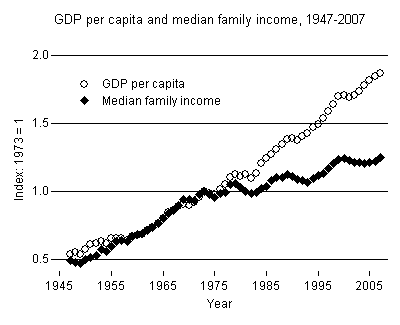
Lane Kenworthy has graphs of real median family income and real GDP per capita here

From 1947 real median family income tracked GDP per capita until about 1978 when real median family income stagnated and GDP continued to rise through 2007

Median family income continued to rise after 1972 but at a much slower rate than before.  Presumably, family incomes continued to grow as hourly earnings declined and stagnated because increasingly families had two earners and/or worked longer hours.  Note also that Kenworthy reports median incomes, not average incomes.

Update on Friday, March 20, 2009 at 04:05PM by Registered CommenterSkeptic

According to a staff report to Obama's Middle Class Task Force:

[T[he President and Vice President recognize that helping families make it through these hard times is just one part of their agenda for lifting up the middle class.  They also are acutely aware of the disconnect between growth and middle-class incomes that persisted even in good times. They know, therefore, that an economic recovery is necessary, but not wholly sufficient to lift the fortunes of the middle class and to correct the economic imbalances that held them back in recent years.

I've seen no evidence that the Middle Class Task Force has seized upon real average hourly earnings as a key focus of its attention.

Update on Sunday, April 5, 2009 at 11:26AM by Registered CommenterSkeptic

This study by MIT professor David Autor, using household survey data that include all types of employment, shows that real hourly incomes of lower wage workers (below about the 60th percentile) declined from 1973-89, while the real hourly incomes of higher wage workers increased.  From 1989 to 2005, wages at all income levels increased, with those at the top and bottom doing better than those in the middle.

Update on Wednesday, April 8, 2009 at 08:54AM by Registered CommenterSkeptic

Gjerstad and Smith argue that the Consumer Price Index has substantially understated inflation since 1999.

In 1983, the Bureau of Labor Statistics began to use rental equivalence for homeowner-occupied units instead of direct home-ownership costs. Between 1983 and 1996, the price-to-rental ratio increased from 19.0 to 20.2, so the change had little effect on measured inflation: The CPI underestimated inflation by about 0.1 percentage point per year during this period. Between 1999 and 2006, the price-to-rent ratio shot up from 20.8 to 32.3.

With home price increases out of the CPI and the price-to-rent ratio rapidly increasing, an important component of inflation remained outside the index. In 2004 alone, the price-rent ratio increased 12.3%. Inflation for that year was underestimated by 2.9 percentage points (since "owners' equivalent rent" is about 23% of the CPI). If home-ownership costs were included in the CPI, inflation would have been 6.2% instead of 3.3%.

To the extent that's right, inflation-adjusted earnings in this period are overstated and are probably still well below the January 1973 level.

Update on Sunday, May 3, 2009 at 10:25AM by Registered CommenterSkeptic

Why do real earnings seem to be rising as the current recession takes hold, and what's the outlook? First, nominal earnings rates are very sticky and tend to keep rising even in recessions because employers fear creating bad morale by reducing nominal wages, or even freezing them. Notice in this article that some employers are giving unpaid furlows instead of reducing wage rates.

Second, as employers cut payrolls by reducing head counts, they tend to lay off lower-paid workers first in order to keep their best workers and managers in place for the expected upturn. This causes the average earnings to increase. 

Third, in a recession, we stop having inflation and start having deflation in prices. Thus, the change in CPI, which is used to adjust nominal earnings to real earnings, makes real earnings increase even if nominal earnings are flat or even declining.

Federal Express announced across the board wage and salary cuts in mid-December.  The Washington Post article linked above reports that hourly earnings rates are now being reduced elsewhere, especially in staffing agency rates. The outlook is for a slow recovery of nominal earnings, according to the WaPo piece:

Experts fear that wages will not keep up. Once the recession ends, economists expect, the recovery will be long and slow, with sluggish job creation. Without a tight labor market, employers won't have to compete as much for talent and workers will have less leverage to push for higher pay, experts say.

"Once you knock down wage growth, it will take a substantial change in unemployment to move it again," said Lawrence Mishel, president of the Economic Policy Institute, a left-leaning think tank in Washington. "The recovery is going to be weak. I think as wage growth subsides, it is going to subside for many years."

Update 17 May 2009: The New York Times reports that the proportion of companies that have implemented salary reductions increased from 8% in February to 21% by the end of April, based on data supplied by compensation consultant Watson Wyatt.

Update on Sunday, May 3, 2009 at 10:23PM by Registered CommenterSkeptic

Paul Krugman agrees there seems to be a general decline in wages explains why that's bad for the economy here.

Update on Sunday, July 26, 2009 at 09:55AM by Registered CommenterSkeptic

Will Wilkinson of the Cato Institute says in 28 pages that the middle class should stop whining about their stagnant and declining incomes and realize that money can't buy happiness. James Kwak pushes back here

Update on Sunday, September 27, 2009 at 09:43AM by Registered CommenterSkeptic

Inflation-adjusted average weekly earnings shows a similar pattern, with August 2009 on the rise but still below the 1960s and 1970s, according to this LAT story.

Average weekly earnings increased from $302.52 (in 1982 dollars) in 1964 to about $330 in about 1972 and then declined to a low of about $260 in about 1988 before rising to $286.49 in August 2009

Update on Tuesday, November 3, 2009 at 09:09PM by Registered CommenterSkeptic

Here's a source that says HP employees haven't had a wage increase in 8 years because HP wants to shed domestic employees and offshore their work. 

Update on Friday, February 5, 2010 at 04:12PM by Registered CommenterSkeptic

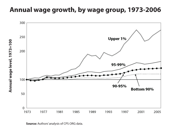
The first graph in the initial post shows that real hourly earnings for production workers--i.e., the ~5/6 of the working population who are not bosses--have not increased at all since 1973.  Here is another graph from Economic Policy Institute that shows there has been only a tiny gain in the average wage level of the bottom 90 percent of all income earners, and almost all of those gains occurred between about 1996 and about 2000 during the dot-com era.

As the following graph from the same EPI post shows, instead of the bottom 90% of income earners getting 90% of the income gains from 1973 to 2006, they got only 15.9%, while the top 1% got 55.6% of the income gains, and 62% of that share went to the top 0.1%. 

In an earlier post, I showed how US real median family income grew steadily from 1947 to 1973 at a compound average annual rate of 3.19%, yielding a doubling time of 23 years. From 1973 to 2006, the rate of increase for the bottom 90% was 0.50%, yielding a doubling time of 144 years. In effect, if not intentionally(?), the economy has developed in ways that steer 100% of the gains to elites. What caused this sea change?  Disco perhaps?  Resurgence of competition from abroad?  Federal government policy changes?  Other things?  The fundamental question is whether it is appropriate for a "government of the people, by the people, for the people" to set rules for a national economy that result in 80-90% of its families not sharing in any of the income gains over a period measured in generations.  

Update on Sunday, February 14, 2010 at 05:43PM by Registered CommenterSkeptic

Ian Welsh presents at Firedoglake a chart very similar to the first one in my lead post.

He follows it with some other charts and a narrative of why this happened: oil and class warfare.

Update on Tuesday, March 16, 2010 at 04:17PM by Registered CommenterSkeptic

Lane Kenworthy has this graph that shows increasing income dispersion.

Update on Sunday, October 24, 2010 at 04:21PM by Registered CommenterSkeptic

Here from Chad Stone at the Center on Budget and Policy Priorities is another graph with different segmentation of the population but showing the same striking divergence of haves from have-nots after 1973.  Note that since 1999 real incomes have stagnated even at the 95th percentile. 

Update on Monday, March 7, 2011 at 02:10PM by Registered CommenterSkeptic

NYT has a set of graphics comparing salaries plus benefits of state and local workers with private sector employees, including this one that shows both leveled off in about 1975.

Update on Saturday, July 7, 2012 at 05:17PM by Registered CommenterSkeptic

Kenneth Thomas in his Middle Class Political Economist blog discusses the pros and cons of various measures of income--hourly or weekly, individual or family, average or median, non-supervisory only or all workers, etc. here.  He also addresses the question whether BLS cost of living stats or some other measure is the best way to adjust nominal incomes over time to comparable real incomes.  And, in a good point I've not seen elsewhere, he points out that if we include in employees' compensation their employers' increasing costs of paying for employee health care there is an important question whether employees received real benefits, i.e., real compensation increases, from those increasing costs.  The whole piece is worth reading, as is his blog in general.

Update on Friday, October 26, 2012 at 09:28AM by Registered CommenterSkeptic

When median real wages are tracked separately by gender, we observe substantial and continuous gains by working women from 1970 to 2000 and stagnation since.  For working men the stagnation began in 1973 and has fluctuated between about 40K and 46K since, being near its low point now. David Ruccio posts the following graph with commentary at Real-World Economics Review Blog

BTW, the ongoing convergence of US wages with Chindian wages that began in the 21st Century should be expected to drive further stagnation and decline of real US wages for both genders.  

Update on Sunday, December 29, 2013 at 12:23PM by Registered CommenterSkeptic

John Cassidy, writing November 18, 2013 in The New Yorker, brings us this powerful image from Piketty and Saez.

Also available here. The real pre-tax incomes (includes realized capital gains) of the top 1% of Americans barely moved from 1930 to 1963, while the incomes of the bottom 99% increased by a factor of about 3.4 from 1930 to 1973. Then in an abrupt reversal of trend, the incomes of the bottom 99% stopped growing except for a little surge from 1993 to 2000, and the incomes of the top 1% got onto a steep and continuing upward trend starting in about 1980.

I like this graph because it zeroes out any possible effect of inflation adjustments which changed over the years and some contend are still not realistic because they don't adequately account for hedonic and quality improvements.  Even if the adjustments are flawed, they are equally flawed for the 99% and the 1%. The graph also shows that from 1973 to about 1995 essentially all of the income gains went to the top 1%, and any gains by the top 2-5% or the top 2-9% necessarily were offset by decreases lower on the ladder. 

Update on Tuesday, August 8, 2017 at 08:50PM by Registered CommenterSkeptic

David Leonhardt at New York Times has an interactive graphic that shows year by year since 1980 income growth rates (vertical scale) shifted from favoring the lower income percentiles (horizontal scale) to strongly favoring the highest percentiles. 

Regretably, the scales did not copy.  Click through to the article for access to the original graph and a stunning interactive graphic that shows the curve changing slope year by year. 

Update on Sunday, September 17, 2017 at 01:12PM by Registered CommenterSkeptic

A recent study based on Social Security data found that inflation-adjusted "lifetime" incomes of American men varied considerably depending on which year they entered the workforce at age 25.  Entry years 1957 through 1967 was a period of rising lifetime incomes for all income levels.  After entry year 1967, lifetime incomes declined for all but the highest income percentiles.  Meanwhile, lifetime incomes for women entering the labor market from 1957 to 1983, the study period, continued to rise.  Graph here.  The NBER study is here (pay wall), and an NYT article with a graph for men is here.  "Lifetime" means prime working years, age 25 to age 55.

Perhaps it's just a coincidence, but the beneficiaries of the rising lifetime incomes were all "Depression Babies," born between 1932 and 1942. 

Update on Saturday, July 28, 2018 at 02:18PM by Registered CommenterSkeptic

Here, at Brookings, is an interesting breakdown of which income tiers in which birth cohorts have or have not surpased their parents earnings. It summarizes work of Raj Chetty et al. published in an NBER working paper December 2016.  In general, the higher the parents earnings, the fewer children surpassed them.  The Chetty paper has much more information, including breakdowns by state.  Good graphics.

Article originally appeared on realitybase (http://www.realitybase.org/).
See website for complete article licensing information.